On web pages with very little content, the footer often fails to stay at the bottom of the screen, instead "sticking" immediately below the content and leaving an ugly gap below. By using the CSS calc() function and vh (view-height) units, we can fix this quickly without complex frameworks.
The Logic Behind the Solution
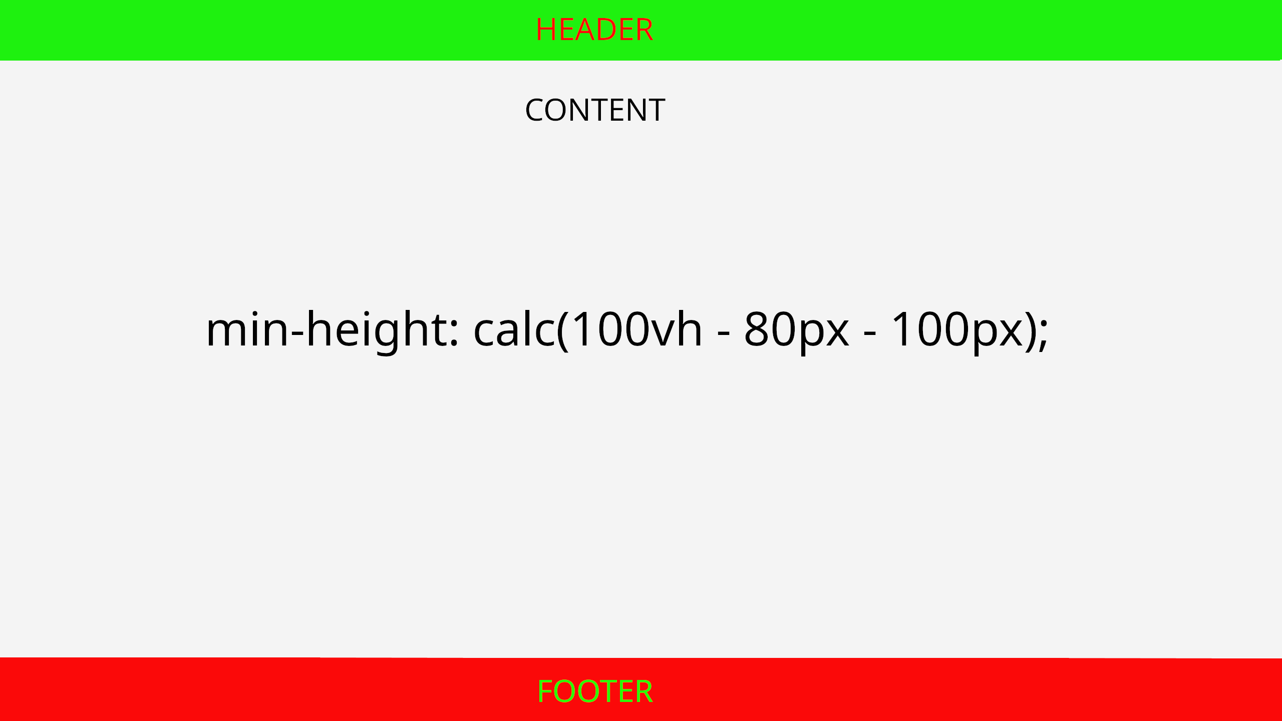
The idea is simple: the main content area of the page must have a minimum height equal to the full screen height minus the height of the header and the footer.
Code Example
Assuming your header is 80px high and your footer is 100px high. We set the main content area like this:
    header {
    height: 80px;
}

main {
    /* 100vh is the full viewport height */
    min-height: calc(100vh - 180px);
}

footer {
    height: 100px;
}
Why Use calc()?
- Flexibility: The function allows mixing different units (e.g., percentages and pixels).
- Responsiveness: Because we use
100vh, the height automatically adjusts whether the user is viewing on a large monitor or a small phone. - Simplicity: There is no need for absolute positioning or flexbox hacks if you only want a basic structure.